
The short answer
The 20/60/20 rule in photography has no single official definition. Most guides use it one of two ways: dividing the frame into a 20% foreground, a 60% main subject and a 20% background, or splitting a shoot into 20% safe shots, 60% refining and 20% bold experiments. Some also apply it to light, midtones and shadow.
It is not a classic rule like the rule of thirds that every photography course teaches. It shows up mostly in blog posts and camera-gear guides, and the sources I read do not fully agree with each other. So instead of pretending there is one right answer, I will walk you through each version and what it actually means for your family portraits.
The good news: you do not need to memorize any of it. Composition and pacing are my job on session day. Knowing the idea behind it just helps you understand why I ask you to do certain things, like starting with the classic group shot or walking toward a tree line.
Version one: foreground, subject and background
The most common definition is about layers. Picture the frame in three bands. The bottom 20% is the foreground, something that gives your eye a place to land, like grass, sand or a low branch. The middle 60% holds the main subject. The top 20% is the background, such as sky, trees or water, which gives the picture room to breathe.
In a family portrait, that 60% is you. Your family should own most of the frame, so faces and connection read clearly even on a phone screen or a small print. The layers above and below add depth, so the image feels like a place you could step into rather than a flat cutout.
Around Tampa Bay this works beautifully with oak canopies overhead, the line of water behind a bayfront railing, or soft sand in the foreground at a Gulf beach. It is one reason I sometimes ask a family to move a few steps forward or back. Those few feet change how the layers stack.
- Foreground (about 20%): grass, sand, flowers or a soft blur of leaves
- Subject (about 60%): your family, close together and connected
- Background (about 20%): sky, water, trees or architecture
Version two: how a session's time gets split
The second meaning is about workflow. The first 20% of a shoot goes to safe, dependable shots. The middle 60% is for refining: new angles, new groupings, small adjustments. The final 20% is for creative risks that might not work but are often the most memorable frames.
This one matches how a good family session actually flows. I start with the full family portrait, everyone looking at the camera, while kids are fresh and outfits are still neat. That is the photo grandma wants framed, so we get it first.
Then we move into combinations and candid moments: parents with each child, siblings together, walking, tickling, swinging little ones between you. The last stretch, often right as golden hour peaks, is when I try backlit shots, silhouettes or a wide frame with lots of sky. If a toddler melts down at that point, the important images are already done.
For families, the real value of this version is peace of mind. You never have to worry that we spent the whole hour on artsy experiments and missed the simple portrait you needed for the wall. The essentials come first, every time.
Version three: light, midtones and shadow
A smaller group of guides uses 20/60/20 to describe tone: about 20% of the image in highlights, 60% in midtones and 20% in shadow. The idea is a balanced photo with depth, not one that is all bright or all dark.
This is where it connects to what you wear. Skin, hair and clothing all count toward that balance. When everyone is in bright white, the highlights take over, especially in strong Florida sun. When everyone is in black, faces can get lost in the shadows. Mostly mid-tone outfits, with a little light and a little deep color, give your photos that natural balance before I ever touch the editing.
Is there a 20/60/20 rule for family photo outfits?
Not officially. When people talk about a percentage rule for outfit colors, they usually mean the 60-30-10 rule borrowed from interior design: about 60% of the group in a main neutral, 30% in a supporting color and 10% in an accent. Many family photographers share it, and it works well.
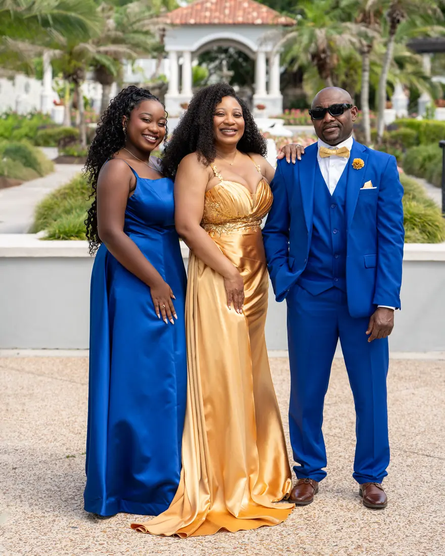
If you want to borrow the 20/60/20 thinking, use the tonal version. Let roughly 60% of your family's outfits sit in soft mid-tones, like dusty blue, sage, tan or mauve. Add about 20% lighter pieces, like cream or ivory, and about 20% deeper anchors, like navy, olive or rust. You end up with a group that looks coordinated without looking matched.
For more ideas on palettes that suit Tampa's greenery and beaches, read my guide on what to wear for family pictures in Tampa. Every family who books with me also gets a styling guide, so you are never guessing alone.
- About 60%: soft mid-tones such as dusty blue, sage, khaki or mauve
- About 20%: lighter pieces such as cream, ivory or soft blush
- About 20%: deeper anchors such as navy, olive, rust or chocolate
- Skip: neon colors, big logos and head-to-toe bright white
A simple checklist that borrows from all three
You do not need to think in percentages to get the benefit. These small habits line up with every version of the rule, and they make a real difference in your gallery.
If something on this list feels like too much, skip it. A relaxed family in imperfect outfits will always photograph better than a stressed family in perfect ones.
- Pick a location with some depth, like trees, water or open sky, rather than a flat wall
- Plan outfits in mostly mid-tones, with one lighter and one deeper color in the mix
- Arrive a few minutes early so the classic family portrait happens while everyone is fresh
- Save energy for the end, when golden hour light invites creative, backlit shots
- Trust the direction, even when a step forward or back feels small
How these ideas play out in a Tampa Bay session
As a Tampa family photographer, I think about all three versions at once, mostly without saying a word about them. Layers guide where I place you. Pacing protects the must-have shots. Tone guides the outfit advice in your styling guide.
Location changes which version matters most. Waterfront spots favor layering with sky and water, which is why South Tampa family photos along the bay often use wide frames. Wooded parks lean on foreground leaves and shade. For St. Petersburg family portraits near the water, the tonal balance shifts as the sun drops toward the Gulf side of the peninsula.
If you are closer to the studio, New Tampa family sessions can happen indoors or at a nearby park, and the same principles apply. An outdoor family session includes one location within 30 miles of Tampa, and I help you choose it. When you are ready, you can book your family session and we will plan the rest together.
Frequently asked questions
No. The rule of thirds splits the frame into a three by three grid and places the subject along those lines. The layered 20/60/20 idea splits the frame top to bottom into foreground, subject and background. They can work together in one family portrait, and I often use both without you noticing.
It is a color guideline borrowed from interior design. About 60% of the group wears a main neutral, 30% wears a supporting color and 10% adds an accent. It keeps a family looking coordinated instead of matched. Your styling guide walks you through choosing those three colors for your location.
Interact with each other instead of staring at the lens. Stand close, keep your hands on each other, shift your weight to your back foot and follow simple prompts like walking or whispering a secret. Comfortable outfits help too. My full guide on not looking awkward goes deeper on posing and outfits.
Soft mid-tones flatter most skin tones: dusty blue, sage, mauve, rust, tan and cream. Very bright white can blow out in strong sun, and very dark colors can hide shape. Choosing two or three colors that sit well together, plus one textured piece, usually flatters everyone in the group.
Not at all. Composition, light and pacing are my job. What helps most is arriving on time, dressing in your planned outfits and letting the kids be themselves. I give simple, guided direction throughout, so even family members who dislike the camera settle in quickly.
Partly. The tonal version applies anywhere, since outfits and light still need balance. The layering version matters less in a studio because the background is simple and controlled. The time-split version applies to every session: we get the classic family portrait first, then move into candid and creative frames.
Keep reading:
What to wear for family pictures in tampa · How to Not Look Awkward in Family Photos · Best places for family pictures in tampa · South Tampa family photos · St Petersburg family photos · New Tampa family photos